Spotify Usage Breakdown
Hello! Welcome to my analysis of my Spotify listening history, where I break down all the wonderful things that I’ve found in my listening history. This write-up was inspired by many of the pieces I found looking up project ideas relating to Spotifyr, and needless to say, I was amazed to see the things that I’ve been listening to.
The first thing we’ll do here is load all of the libraries we’re going to use!
library(jsonlite)
library(lubridate)
library(ggrepel)
library(gghighlight)
library(tidyverse)
library(knitr)
library(ggplot2)
library(plotly)
library(pheatmap)
library(spotifyr)
The cool thing about this project is that you’ll need to first request that Spotify sends you your personal account data, and depending on how you use and listen to music on Spotify, this can take a week up to a month for them to give you everything via email.
Spotifyr is the package that houses the tools needed to access the API that houses Spotify’s very comprehensive data on all the music we listen to that is attributed to our user profiles.
You’ll then link your account to the developer.spotify.com part of their website to make an app in order to get your access keys to the API. After we can grab the access keys, we can use the spotifyr package to get everything we need! We’re then going to call the API in order to pull their data into R Studio (or your IDE of choice), so that we can analyze it and manipulate everything.
The data stored in the files Spotify gives you is in JSON, so the jsonlite package parses everything out and sorts the data neatly into a data frame which we can then work with using the tidyverse.
Setting up and Getting the Data
#Streaming history file from Spotify
streamhist <- fromJSON("StreamingHistory0.json", flatten = TRUE)

streamhist <- streamhist %>%
  as_tibble() %>%
  mutate_at("endTime", ymd_hm) %>%
  mutate(endTime = endTime - hours(6)) %>%
  mutate(date = floor_date(endTime, "day") %>% as_date, minutes = msPlayed / 60000)

#For these last two data frames, we're going to be referencing them later to make our plots
num_artist_played <- streamhist %>% group_by(artistName) %>% tally() %>% arrange(desc(n))
num_tracks_played <- streamhist %>% group_by(artistName, trackName) %>% tally() %>% arrange(desc(n))
list_of_top_20_artists <- streamhist %>% count(artistName) %>% arrange(desc(n)) %>% slice_head(n = 20)
list_of_top_20_tracks <- streamhist %>% count(artistName, trackName) %>% arrange(desc(n)) %>% slice(1:20)

print(list_of_top_20_artists)
## # A tibble: 20 × 2
##    artistName               n
##    <chr>                <int>
##  1 WWE                    310
##  2 Hank Trill             129
##  3 The Radio Dept.        124
##  4 Kanye West             120
##  5 SZA                    100
##  6 Chance the Rapper       96
##  7 Gorillaz                91
##  8 Guru                    75
##  9 Kendrick Lamar          70
## 10 A Tribe Called Quest    62
## 11 the pillows             62
## 12 Free Nationals          61
## 13 De La Soul              57
## 14 Digable Planets         56
## 15 Terrace Martin          50
## 16 David Bowie             44
## 17 Bodikhuu                43
## 18 Akeem Ali               41
## 19 Outkast                 41
## 20 Scooter                 41
print(list_of_top_20_tracks)
## # A tibble: 20 × 3
##    artistName           trackName                                                n
##    <chr>                <chr>                                                <int>
##  1 Hank Trill           Propane Money 2                                         34
##  2 Hank Trill           Swahili                                                 28
##  3 The Radio Dept.      Never Follow Suit                                       26
##  4 SZA                  Kill Bill                                               24
##  5 Dabeull              Day & Night                                             22
##  6 Chris Crack          Hoes at Trader Joe's                                    19
##  7 Alice Deejay         Better Off Alone                                        18
##  8 Downstait            Kingdom                                                 18
##  9 A Tribe Called Quest Electric Relaxation                                     17
## 10 The Weeknd           Out of Time                                             17
## 11 Ricky Reed           Real Magic                                              16
## 12 Rollergirl           Dear Jessie                                             16
## 13 gum.mp3              Seen It Before                                          16
## 14 Akeem Ali            Keemy Casanova )                                        15
## 15 Dungeon Family       Rollin' (feat. André 3000, Cee-Lo & Society Of Soul)    15
## 16 Kanye West           Believe What I Say                                      15
## 17 Scooter              Nessaja                                                 15
## 18 Butcher Brown        Gum In My Mouth                                         14
## 19 Fugees               Nappy Heads - Remix                                     14
## 20 G Perico             Billie Jean                                             14
First, we’re going to use our “streamhist” data to grab us a list of the top artists that we listen to that are present in our streaming history, then we’ll grab the name of the artists, count the number of times they appear each, rearrange them and them only present the top 20 rows.
Then, I’m summoning the “abridgedtop20data”, using the script below and then saving it to a .csv so that the rest of the analysis can run, and I won’t have to call the API over and over. Along with this, you’ll also make two separate data frames with the number of times each artist and track was played.
The json file being read in the first call is in the ‘my_spotify_data’ file that you get from Spotify directly, titled ‘StreamHistory0.json. For me, this was the only file, but for others it can be several depending on your usage, hence the length of time it takes you to receive the data at hand.
####-----------------

##Calling the API with spotifyr

#For use with your Client ID:
Sys.setenv(SPOTIFY_CLIENT_ID = 'xxxxxxxxxxxxxxxxxxxxxxxxxx')

#For use with your Client Secret:
Sys.setenv(SPOTIFY_CLIENT_SECRET ='xxxxxxxxxxxxxxxxxxxxxxxxxx')

#The access token you'll need to use Spotify's API
get_spotify_authorization_code()
access_token <- get_spotify_access_token()

####-----------------
#Grab audio features for each artists using spotifyr
favArtist1 <- get_artist_audio_features(artist= "WWE")
favArtist2 <- get_artist_audio_features(artist= "Hank Trill")
favArtist3 <- get_artist_audio_features(artist= "The Radio Dept")
favArtist4 <- get_artist_audio_features(artist= "Kanye West")
favArtist5 <- get_artist_audio_features(artist= "SZA")
favArtist6 <- get_artist_audio_features(artist= "Chance the Rapper")
favArtist7 <- get_artist_audio_features(artist= "Gorillaz")
favArtist8 <- get_artist_audio_features(artist= "Guru")
favArtist9 <- get_artist_audio_features(artist= "Kendrick Lamar")
favArtist10 <- get_artist_audio_features(artist= "A Tribe Called Quest")
favArtist11 <- get_artist_audio_features(artist= "the pillows")
favArtist12 <- get_artist_audio_features(artist= "Free Nationals")
favArtist13 <- get_artist_audio_features(artist= "De La Soul")
favArtist14 <- get_artist_audio_features(artist= "Digable Planets")
favArtist15 <- get_artist_audio_features(artist= "Terrace Martin")
favArtist16 <- get_artist_audio_features(artist= "David Bowie")
favArtist17 <- get_artist_audio_features(artist= "Bodikhuu")
favArtist18 <- get_artist_audio_features(artist= "Akeem Ali")
favArtist19 <- get_artist_audio_features(artist= "Outkast")
favArtist20 <- get_artist_audio_features(artist= "Scooter")

#Bind to singular data frame
top20data <- rbind(favArtist1, favArtist2, favArtist3, favArtist4, favArtist5,
                   favArtist6, favArtist7, favArtist8, favArtist9, favArtist10,
                   favArtist11, favArtist12, favArtist13, favArtist14,
                   favArtist15, favArtist16, favArtist17, favArtist18,
                   favArtist19, favArtist20)


#Select only relevant columns
abridgedTop20Data <-
        select(top20data, c('artist_name', 'album_release_date', 'time_signature', 'duration_ms', 'danceability','energy',
                                   'valence', 'loudness','speechiness',
                                   'acousticness','liveness','instrumentalness',
                                   'tempo','explicit', 'key_mode'))

#Generate minutes column for later
abridgedTop20Data <- abridgedTop20Data %>%
  mutate(duration_mins = duration_ms / 60000)

#write .csv
write.csv(abridgedTop20Data, "abridgedTop20Data.csv", row.names = FALSE)
abridgedTop20Data <- read.csv("abridgedTop20Data.csv", stringsAsFactors = FALSE)
To further break down what’s happening here, the first thing we’re going to do is call the API.
In order to receive your API access keys, you will need to make an app on developer.spotify.com, you can then use these calls to access Spotify’s API. After the script runs your ID and secret, it saves your access token as an object so that the other functions we run can call back to the access token so that it can self-validate.
Below the API call, we’re asking spotifyr to grab the artist audio features of every artist that appeared in our list, we then use rbind to paste all of the resulting data frames together. The information in the data frames that spotifyr generates is very comprehensive, so I’m going to have to grab just the columns we need to produce the data we can use for analysis.
For the purposes of this project, I want to avoid calling the API every time I want to rerun the scripts as it will time you out if you attempt to call the API too many times. So I recommend calling the API first, saving the abridged data to a .csv and then recall it to a new dataframe that the scripts below will use to carry out the rest of the analysis; as I’ve done above.
Exploration
Now, we’re going to take a further look at the data we’ll need to make our visualizations. Thankfully, Spotify’s data is pretty clean and well-formatted on its own, so no real cleaning is needed outside of outliers you’ll find here and there.
#For use with later plots
meanTop20ArtistsData <- abridgedTop20Data %>%
  group_by(artist_name) %>%
  summarise(mean_danceability = mean(danceability), mean_energy = mean(energy),
            mean_valence = mean(valence), mean_loudness = mean(loudness),
            mean_speechiness = mean(speechiness),
            mean_acousticness = mean(acousticness),
            mean_liveness = mean(liveness),
            mean_instrumentalness = mean(instrumentalness),
            mean_tempo = mean(tempo), mean_explicit = mean(explicit), n = n())

meanTop20ArtistsData[10,1] <- "Guru"

meanTop20ArtistsData <- merge(list_of_top_20_artists, meanTop20ArtistsData, by.x = "artistName", by.y = "artist_name")

# Distributions of songs by artists
song_distributions <- abridgedTop20Data %>%
  group_by(artist_name) %>%
  summarize(mean_song_length = mean(duration_mins),
            median_song_length = median(duration_mins),
            sd_song_length = sd(duration_mins),
            min_song_length = min(duration_mins),
            max_song_length = max(duration_mins),
            n_songs = n())
I had all the columns in the abridged version of the Top 20 data set summarized to their mean, as it will make plotting for central tendency much more concise. For song distributions, I did the same thing for each measure of central tendency, so everything would be more to the point when plotting that data.
What does my music look like?
Now that I have my data, let’s make visualizations with it! I formulated some pretty interesting hypotheses that were corroborated through visualization. For example, see below.
#Most frequently mentioned artists & tracks
list_of_top_20_artists %>% group_by(artistName) %>%
  ggplot(., aes(y = artistName, x = n)) +
  geom_col(aes(fill = n)) +
  theme_minimal() +
  theme(legend.position = "bottom") +
  labs(
    title = "Top Artists by # of Times Played",
    subtitle = "How many times were their songs played from start to finish?",
    y = "Artist Name",
    fill = "n"
  )
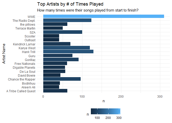
Here, we asking, “Who were the most frequently played artists in my streaming history?” The resulting plot gave me a great idea in that for the rest of this analysis, because WWE represents such a large number of my consumed music, that I’d omit that outlier to get a better view of my data.
list_of_top_20_tracks %>% group_by(trackName) %>%
  ggplot(., aes(y = trackName, x = n)) +
  geom_col(aes(fill = artistName), show.legend = T) +
  labs(
    title = "Number of Track Spins by Artist",
    subtitle = "How many times was a song played from start to finish?",
    y = "Track Name",
    fill = "Artist Name"
  ) +
  scale_fill_discrete(type = "viridis") +
  theme(legend.position = "bottom")
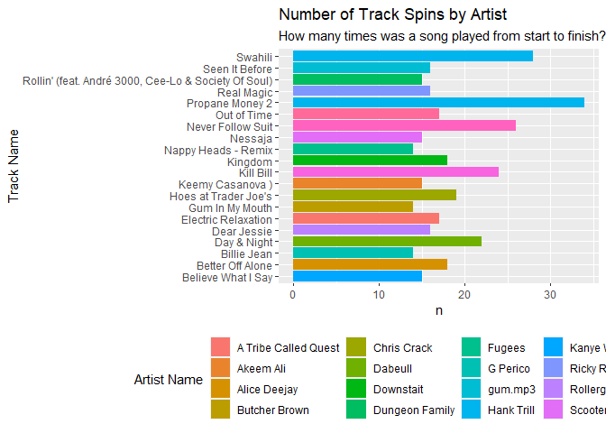
This one is pretty straight forward, I’m asking of the data “How many times was a song played from start to finish?”. I clearly thought Hank Trill was the best thing since sliced bread, so as such, I’ve listed to “Propane Money 2” a total of 38 times.
#Mean song distributions with Box plot
song_distributions %>% ggplot(aes(y = mean_song_length)) +
  geom_boxplot() +
  labs(title = "Mean Song Lengths by Artists", y = "Average Mintues") +
  scale_y_continuous(breaks = seq(0, 5, by = .5)) +
  theme_minimal() +
  theme(axis.title.y = element_text(margin = margin(t = 0, r = 10, b = 0, l = 0)))
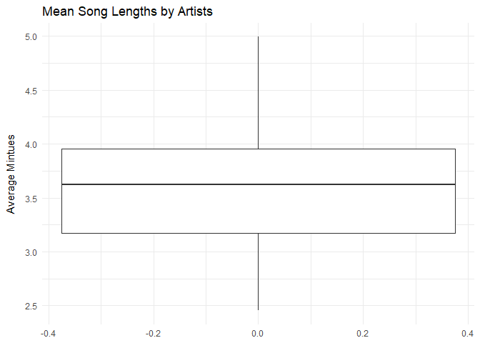
Here, I wanted to get a general view of the song lengths data to check for outliers and things. Nothing too crazy in terms of the numbers.
#Distribution Plots based on Top 20
song_distributions %>% ggplot() +
  geom_histogram(aes(x = median_song_length), stat = "density", alpha = .8, bins = 20) +
  scale_x_continuous(breaks = seq(0, 5, by = .2)) +
  scale_color_brewer(palette = "Set3") +
  labs(
    title = "Median Song Lengths for Top 20 Artists",
    x = "Song Length",
    y = "Density"
  ) +
  theme_minimal()
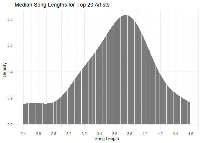
For this, I specifically took a look at the median song lengths and their density, again, nothing too crazy, I’m more so looking at the spread of the data presented to check for outliers. What’s presented here is consistent with the above chart, the median song length for my data is around 3.75 minutes.
streamhist2 <- streamhist %>% group_by(artistName) %>% summarise(total_min = sum(minutes)) %>% arrange(desc(total_min)) %>% slice(1:20)

streamhist2 %>%
  ggplot() +
  scale_fill_gradient(low = "darkgrey", high = "limegreen") +
  geom_bar(aes(x = total_min, y = artistName, fill = total_min), stat = "identity") +
  labs(
    title = "Most Played Artists by the Minute",
    subtitle = "Includes both track times and podcasts",
    x = "Total Mins",
    y = "Artist Name",
    fill = ""
  ) +
  theme(plot.title = element_text(face = "bold"), plot.caption = element_text(size = 6.5), legend.position = "bottom") +
  theme_minimal()
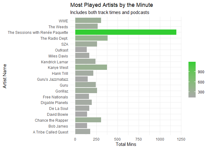
For this plot, I wanted to check out the most played artists by the minute, meaning for each artist, how long did I actually listen to their music. Interesting WWE here is very low, but that’s because they only have entrance music and for everytime I played something of theirs, it only last around 3:00 or so each play. Compared to “The Sessions” which is a podcast, that outlier checks out as I listen to those episodes from start to finish.
song_distributions %>% ggplot(aes(x = artist_name, y = max_song_length, color = artist_name, label = artist_name)) +
  geom_point() +
  geom_label_repel(hjust = 0, vjust = .5, show.legend = F) +
  labs(title = "Max Song Lengths by Artists", x = "Artist", y = "Song Minutes") +
  theme_minimal() +
  theme(axis.text.x = element_blank(),
        axis.title.y = element_text(margin = margin(t = 0, r = 10, b = 0, l = 0)),
        axis.ticks.x = element_blank(), legend.position = "")
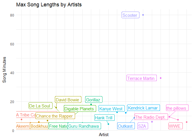
Apparently, Scooter and Terrace Martin have songs/sets that are 40 - 80 mins long, accounting for the outliers found above, which I found interesting. I didn’t even know Spotify had tracks that were that long.
top20EnergyValencePlot <- meanTop20ArtistsData %>%
  ggplot(aes(x = mean_valence, y = mean_energy, color = artistName, label = artistName)) +
  geom_text_repel(hjust = 0, vjust = 0, show.legend = F) +
  geom_point(alpha = 0.5, show.legend = T) +
  scale_size(range = c(0, 12)) +
  geom_vline(xintercept = 0.5) +
  geom_hline(yintercept = 0.5) +
  scale_x_continuous(expand = c(0, 0), limits = c(0, 1)) +
  scale_y_continuous(expand = c(0, 0), limits = c(0, 1)) +
  annotate('text', 0.25 / 2, 0.95, label = "Angry") +
  annotate('text', 1.75 / 2, 0.95, label = "Happy") +
  annotate('text', 1.75 / 2, 0.05, label = "Peaceful") +
  annotate('text', 0.25 / 2, 0.05, label = "Depressing") +
  labs(x = "Valence", y = "Energy") +
  ggtitle("Emotional Quadrant For My Top 20 Artists", "Position based on energy and valence, size based on number of songs (Short Term)") +
  theme_minimal() +
  theme(plot.title = element_text(face = "bold"), plot.caption = element_text(size = 6.5), legend.position = "bottom") +
  guides(col = "none")
plot(top20EnergyValencePlot)
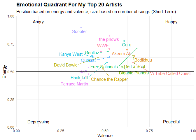
This chart was made to show exactly where my music fell along the four emotional quadrants. For x, Energy is self-explanatory.
However, for y, Spotify’s documentation defines Valence as: “A measure from 0.0 to 1.0 describing the musical positiveness conveyed by a track. Tracks with high valence sound more positive (e.g. happy, cheerful, euphoric), while tracks with low valence sound more negative (e.g. sad, depressed, angry).”
So considering that, each of the four quadrants represents an emotional extreme, so we can see where exactly all of our music falls along those lines.
Everything in the Top 20 of my most listened to tracks are pretty neutral, for the most part. Most of my artists are on the more happy or angry sounding side than not, and there’s a lot of energy present in my music. I guess I’m not the edge lord I thought I was. Hilariously, Scooter’s music was found the be the most angry thing on my list…
So let’s try to answer some more questions.
top20tempo_energyplot <-
  ggplot(meanTop20ArtistsData, aes(x = mean_tempo, y = mean_energy,
                                   label = artistName, color = artistName)) +
  geom_point(aes(color = artistName), alpha = .5, show.legend = F) +
  scale_x_continuous(expand = c(0, 0), limits = c(90, 150)) +
  scale_y_continuous(expand = c(0, 0), limits = c(.45, .75)) +
  labs(x = "Tempo", y = "Energy") +
  geom_text_repel(hjust = 0, vjust = 0, show.legend = F) +
  ggtitle("Top 20 Artists by Tempo & Energy", "Are faster songs more energetic?") +
  theme_minimal() +
  theme(plot.title = element_text(face = "bold"))
plot(top20tempo_energyplot)
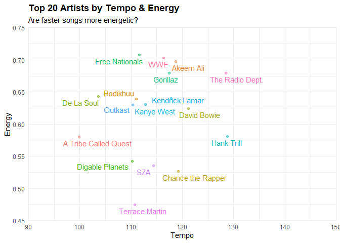
Here, I’m looking to answer, does the catalog of the top 20 artists I listen have a body of work that is of a certain tempo and energy threshold? Can I reasonably say that there is a correlation between the two? Most the indie stuff that I listen to that’s high tempo does have good energy.
Now, the Rap/Hip-Hop/RnB artists that I listen to are also about right. Considering that those genres of music tend to fall between the 90-120 range as far as tempo goes. The artists that fall into that genre have music that’s high energy, but fall into the range I gave being below 115 BPM.
Next…
top20dance_valplot <-
  ggplot(meanTop20ArtistsData, aes(x = mean_danceability, y = mean_valence,
                                   label = artistName, color = artistName)) +
  geom_point(aes(color = artistName), alpha = .5, show.legend = F) +
  scale_x_continuous(expand = c(0, 0), limits = c(.4, .85)) +
  geom_text_repel(hjust = 0, vjust = 0, show.legend = F) +
  labs(x = "Danceability", y = "Valence",
       title = "Top 20 Artists by Danceability & Valence",
       subtitle = 'Are more happier sounding songs danceable?') +
  theme_minimal() +
  theme(plot.title = element_text(face = "bold"))
plot(top20dance_valplot)
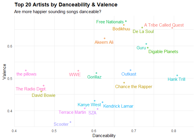
Here we’re looking at Danceability and Valence. Danceability can be described how easy is the artist’s music to dance to and is a number measured from 0 to 1. 0 is least, 1 is most.
Of the artists featured here, nothing should be really surprising. The Radio Department, the pillows, and David Bowie aren’t what I’d call danceable. Fun to chill to, but not danceable music. Pretty much everything from 0.58 or so and up on the danceability scale is Rap/Hip-Hop/RnB.
Also, heck yeah Guru, ATCQ and De La Soul are danceable, way to be spot on Spotify!
Then we have…
top20selplot <-
  ggplot(meanTop20ArtistsData, aes(x = mean_speechiness, y = mean_explicit, size = mean_loudness, label = artistName)) +
  geom_text_repel(hjust = 0, vjust = 0, show.legend = F) +
  geom_point(aes(color = artistName), alpha = .5) +
  labs(x = "Speechiness", y = "Explicit", size = "Loudness", color = "Catalog Size", caption = "smallest = Digable Planets") +
  ggtitle("Top 20 Artists by Speechiness, Explicitness and Loudness", "Are the more 'speechy' tracks for top artists inherently explicit and loud?") +
  theme_minimal() +
  theme(plot.title = element_text(face = "bold"), legend.position = "bottom")
plot(top20selplot)
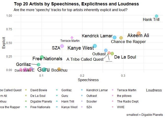
Here, we take a look at a plot that measures the Speechniness of music (that is how much verbal speech it contains).
While acousticness, liveness, and instrumentalness aren’t talked about as much here, but they are important to talk about. The first measures if a given track is acoustic or not. Liveness measures if a track has the presence of an audience in the recording. While the last one predicts whether or not a track contains no vocals.
All of these variables are measured from 0 to 1, which will be of importance later. Regarding speechiness, Spotify’s documentation describes it as: “The more exclusively speech-like the recording (e.g. talk show, audio book, poetry), the closer to 1.0 the attribute value. Values above 0.66 describe tracks that are probably made entirely of spoken words.
Values between 0.33 and 0.66 describe tracks that may contain both music and speech, either in sections or layered, including such cases as rap music. Values below 0.33 most likely represent music and other non-speech-like tracks.”
How Explicit (swears/curses) a given artist’s music is, is what’s being visualized here along with how loud their music is inherently. This is measured between 0 and 1 on the y axis, while values typically range between -60 and 0 db for Loudness and are measured through a given points color.
According to this, you can imagine, most of the Rap/Hip-Hop/RnB artists have music that is the mostly Explicit, while also being speech-heavy and loud. Stereotypes be damned… but seriously, this all tracks as Thundercat and Nujabes make music for a more “chill” demographic and are reflected as such in the data. It’s funny to me how Kendrick Lamar, Chance, Akeem Ali and Hank Trill (being the highest) have music consisting of over 50% swears.
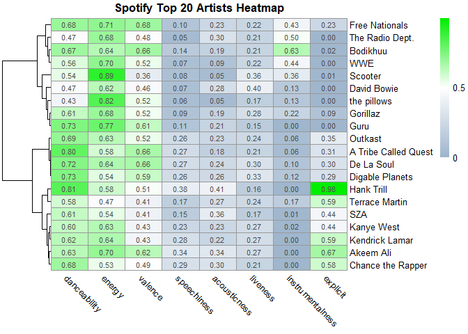
Heatmap
Now for the heatmap I’m doing for this analysis, I stayed far, far away from base R’s syntax because using it took forever to format and it wasn’t all that pretty or customizable, so I used a package called pheatmap.
The first thing I did here was make a copy of the data…
meanTop20ArtistsData_copy <- as.data.frame(meanTop20ArtistsData)
song_distributions_copy <- as.data.frame(song_distributions)
…then I ascribed the names in column 1 to the row names of the data frame
row.names(meanTop20ArtistsData_copy) <- meanTop20ArtistsData_copy[,1]
row.names(song_distributions_copy) <- song_distributions_copy[,1]
Next, I removed both categorical variables and columns where they’re numeric, but they don’t measure from 0 to 1. This is because as its a heatmap, all the values being measured need to equal from 0 to 1, or everything will be thrown off and it won’t make sense because nothing scales meaningfully. So to that end, the names and genres are removed, along with loudness, tempo, and “n” (which represents the size of an artist’s catalog).
meanTop20ArtistsData_copy$artistName <- NULL
meanTop20ArtistsData_copy$genres <- NULL
meanTop20ArtistsData_copy$mean_loudness <- NULL
meanTop20ArtistsData_copy$mean_tempo <- NULL
meanTop20ArtistsData_copy$n.x <- NULL
meanTop20ArtistsData_copy$n.y <- NULL

song_distributions_copy$artist_name <- NULL
song_distributions_copy$n_songs <- NULL
song_distributions_copy$min_song_length <- NULL
song_distributions_copy$max_song_length <- NULL
song_distributions_copy$sd_song_length <- NULL
Now, I’m going to rename the columns for readability’s sake, and turn the data frame into a matrix, because heatmap objects need to be based from numeric matrices in order to be usable.
#Rename columns

colnames(meanTop20ArtistsData_copy) <- c("danceability", "energy", "valence",
                                         "speechiness", "acousticness",
                                         "liveness", "instrumentalness",
                                         "explicit")
#Turn data into matrix
meanTop20ArtistsData_copy <- as.matrix(meanTop20ArtistsData_copy)
song_distributions_copy <- as.matrix(song_distributions_copy)
Now, I’ll make the heatmap in the codes below.
#Make heatmap
top20heatmap <-
  pheatmap(
    meanTop20ArtistsData_copy,
    cluster_rows = T,
    clustering_distance_rows = "correlation",
    legend_breaks = c(0, 0.5, 1),
    legend_labels = c("0", "0.5", "1"),
    cluster_cols = F,
    angle_col = "315",
    color = colorRampPalette(c("slategray3", "white", "green2"))(100),
    display_numbers = T,
    main = "Spotify Top 20 Artists Heatmap"
  )
print(top20heatmap)
Behold! Below I’m making another heat map that details the data as it’s being scaled before rendering it into the plot. Scaling aligns the values so that drastic fluctuations in the data set are toned down
top20heatmapscaled <-
  pheatmap(
    meanTop20ArtistsData_copy,
    cluster_rows = T,
    clustering_distance_rows = "correlation",
    legend_breaks = c(-2, 0, 2),
    legend_labels = c("-2", "0", "2"),
    cluster_cols = F,
    angle_col = "315",
    color = colorRampPalette(c("slategray3", "white", "green2"))(100),
    display_numbers = T,
    scale = "row",
    main = "Spotify Top 20 Artists Heatmap (Short Term, Scaled)"
  )
print(top20heatmapscaled)
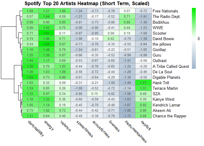 As you can
see from both heatmaps, they validate many of the assumptions I made in
the previous plots. It also makes drawing useful insights more easy,
because everything is visualized right in front of you, making
comparisons easier.
As you can
see from both heatmaps, they validate many of the assumptions I made in
the previous plots. It also makes drawing useful insights more easy,
because everything is visualized right in front of you, making
comparisons easier.
top20distributions <-
  pheatmap(
    song_distributions_copy,
    cluster_rows = T,
    clustering_distance_rows = "correlation",
    legend_breaks = c(-2, 0, 2),
    legend_labels = c("-2", "0", "2"),
    cluster_cols = F,
    angle_col = "315",
    color = colorRampPalette(c("slategray3", "white", "green2"))(100),
    display_numbers = T,
    main = "Spotify Top 20 Artists Song Lengths"
  )
print(top20distributions)
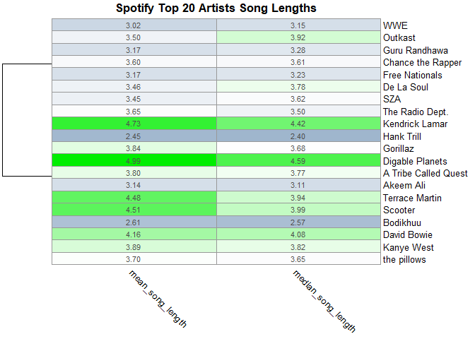 For this
third heatmap, I wanted to take the data of the song length
distributions I made earlier to give us a good metric to gauge and make
comparisons.
For this
third heatmap, I wanted to take the data of the song length
distributions I made earlier to give us a good metric to gauge and make
comparisons.
Conclusion
That does it for my Spotify Top 20 short-term Most Listened to Artists! Thank you reading, I hope you enjoyed reading this as much as I had fun making it.
Extra
While you’re here, check out my Ultimate EuroDance Playlist, it’s cheesy, uplifting goodness! Perfect for your working or errand days.