A Particular Group leads in DC Area Traffic Stops
This is a project based on a tutorial my friend Carlos made to help me learn R initally. I took the content and expanded on it to make the plots you’ll see below. Much of the syntax is tidyverse, so this should serve as a good primer of things to do when getting acclimated to the language. The data set I’m using here is one based on traffic violations through the D/C and surrounding area.
Loading our libraries
library(tidyverse)
library(lubridate)
library(plotly)
library(sf)
library(ggrepel)
As I mentioned, we’ll be primarily using Tidyverse, along with lubridate, mapview and sf for working with coordinate data.
Exploration
First, we’ll import our data
traffic <-
  read.csv("/Users/bruce/Documents/Old R Projects/bRuce/Data/select_traffic2.csv"
           ,
           stringsAsFactors = FALSE)
‘stringsAsFactors’ makes the column names not inherit the spaces present in the original dataset
Before we get started with cleaning, let’s do some preliminary exploration with our data to get a grasp on what we’re working with.
Below will output the first 20 rows, while summary includes measures of central tendency for evaluating our data.
head(traffic[1:20,])
##   X                                SeqID Date.Of.Stop Agency                                       SubAgency Latitude Longitude Accident
## 1 1 81ebccdf-77d5-4cf1-93d7-bd6eb03ae6a1    4/12/2018    MCP                     3rd District, Silver Spring 38.99958 -76.99601       No
## 2 2 d2584fc9-dc7d-4d2a-ab28-68a6b6930688   11/10/2016    MCP                           4th District, Wheaton 39.05532 -77.05016       No
## 3 3 36426586-974b-416e-b778-d894beb5e936    1/31/2018    MCP                          2nd District, Bethesda 39.05342 -77.08926       No
## 4 4 a453cf70-5fc4-46ed-b902-099b15153342    12/8/2015    MCP 6th District, Gaithersburg / Montgomery Village 39.14160 -77.22586       No
## 5 5 49d2065b-c652-45ac-b4a3-87dcab0be193    9/14/2016    MCP                           4th District, Wheaton 39.05448 -77.05079       No
## 6 6 3dd0f0c6-dd0e-458d-b11c-9cd13e3caa54    5/15/2016    MCP                          2nd District, Bethesda 38.98801 -77.09504       No
##   Belts Personal.Injury Property.Damage Fatal HAZMAT Alcohol State        VehicleType Year Violation.Type Contributed.To.Accident     Race
## 1    No              No              No    No     No      No    MD    02 - Automobile 2010        Warning                   FALSE    BLACK
## 2    No              No              No    No     No      No    MD    02 - Automobile 2010       Citation                   FALSE    BLACK
## 3    No              No              No    No     No      No    MD    02 - Automobile 1999        Warning                   FALSE    OTHER
## 4    No              No              No    No     No      No    MD    02 - Automobile 2004        Warning                   FALSE HISPANIC
## 5    No              No              No    No     No      No    MD 03 - Station Wagon 2012        Warning                   FALSE    BLACK
## 6    No              No              No    No     No      No    VA    02 - Automobile 2003        Warning                   FALSE    WHITE
##   Gender DL.State         Arrest.Type                           Geolocation
## 1      M       MD   A - Marked Patrol                 (38.99958, -76.99601)
## 2      M       MD   A - Marked Patrol         (39.05532, -77.0501583333333)
## 3      F       MD   A - Marked Patrol        (39.053425, -77.0892583333333)
## 4      M       MD   A - Marked Patrol (39.1415966666667, -77.2258616666667)
## 5      M       MD B - Unmarked Patrol         (39.0544816666667, -77.05079)
## 6      F       MD   A - Marked Patrol (38.9880133333333, -77.0950366666667)
summary(traffic)
##        X            SeqID           Date.Of.Stop          Agency           SubAgency            Latitude       Longitude
##  Min.   :    1   Length:50000       Length:50000       Length:50000       Length:50000       Min.   : 0.00   Min.   :-94.61
##  1st Qu.:12501   Class :character   Class :character   Class :character   Class :character   1st Qu.:39.02   1st Qu.:-77.19
##  Median :25001   Mode  :character   Mode  :character   Mode  :character   Mode  :character   Median :39.06   Median :-77.08
##  Mean   :25001                                                                               Mean   :36.28   Mean   :-71.59
##  3rd Qu.:37500                                                                               3rd Qu.:39.13   3rd Qu.:-77.03
##  Max.   :50000                                                                               Max.   :39.70   Max.   :  0.00
##
##    Accident            Belts           Personal.Injury    Property.Damage       Fatal              HAZMAT            Alcohol
##  Length:50000       Length:50000       Length:50000       Length:50000       Length:50000       Length:50000       Length:50000
##  Class :character   Class :character   Class :character   Class :character   Class :character   Class :character   Class :character
##  Mode  :character   Mode  :character   Mode  :character   Mode  :character   Mode  :character   Mode  :character   Mode  :character
##
##
##
##
##     State           VehicleType             Year      Violation.Type     Contributed.To.Accident     Race              Gender
##  Length:50000       Length:50000       Min.   :   0   Length:50000       Mode :logical           Length:50000       Length:50000
##  Class :character   Class :character   1st Qu.:2002   Class :character   FALSE:48822             Class :character   Class :character
##  Mode  :character   Mode  :character   Median :2007   Mode  :character   TRUE :1178              Mode  :character   Mode  :character
##                                        Mean   :2006
##                                        3rd Qu.:2011
##                                        Max.   :9999
##                                        NA's   :358
##    DL.State         Arrest.Type        Geolocation
##  Length:50000       Length:50000       Length:50000
##  Class :character   Class :character   Class :character
##  Mode  :character   Mode  :character   Mode  :character
##
##
##
##
In the code above, we want to run summary, because this will allow us to get a good bird’s eye view on the data to see if there are outliers present and possible maligned data.
Now that I’ve viewed everything, to get started with the cleaning process, I’m going to get rid of all columns and transform others to get the data to a more workable state.
traffic$X <- NULL
traffic <- na.exclude(object = traffic)
accidents <- subset(traffic, traffic$Accident == "Yes")
sapply(accidents, class)
##                   SeqID            Date.Of.Stop                  Agency               SubAgency                Latitude
##             "character"             "character"             "character"             "character"               "numeric"
##               Longitude                Accident                   Belts         Personal.Injury         Property.Damage
##               "numeric"             "character"             "character"             "character"             "character"
##                   Fatal                  HAZMAT                 Alcohol                   State             VehicleType
##             "character"             "character"             "character"             "character"             "character"
##                    Year          Violation.Type Contributed.To.Accident                    Race                  Gender
##               "integer"             "character"               "logical"             "character"             "character"
##                DL.State             Arrest.Type             Geolocation
##             "character"             "character"             "character"
The first call Gets rid of the useless ‘x’ column, then I’m removing NA rows from data set. After, I’m using sapply to see which classes my columns in the datasets are, lapply can work as well, this will come into play later.
accidents$Vehicle.Year <- accidents$Year
accidents$Year <- NULL
accidents$Vehicle.Year <- as.numeric(accidents$Vehicle.Year)
accidents <- accidents[,c(1:14,23,15:22)]
The above is needed for next steps, I’m changing the column name and type, then reordering everything for neatness sake.
Now, i’m going to make a basic histogram which helps me to visual outliers and other anomalys.
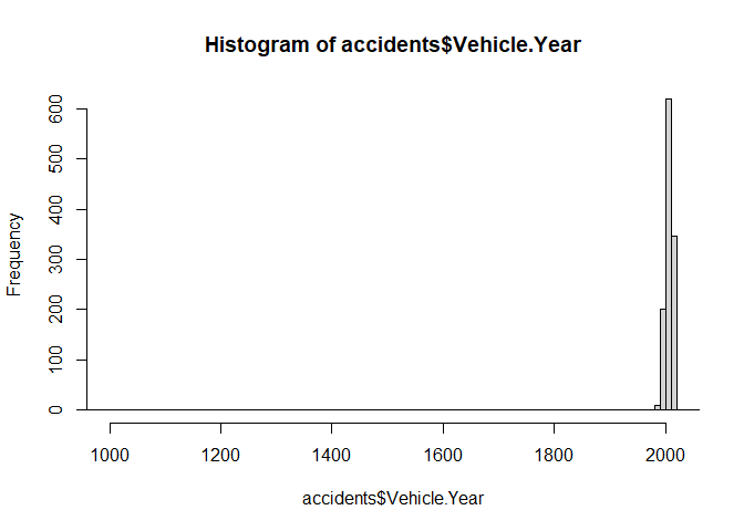
Strangely enough, there’s an outlier ‘0’ that’s throwing off the data, so when I run the below, it should tell me where to find it. I’m also checking for number of rows with 0 within “Vehicle Year”. After, I’m checking for NAs, rerunning summary stats, and then identifying and eliminating outliers.
Lastly, I’ll rerun the histograms to verify numbers
sum(accidents$Vehicle.Year == '0', na.rm=TRUE)
## [1] 1
sum(is.na(accidents))
## [1] 0
summary(accidents)
##     SeqID           Date.Of.Stop          Agency           SubAgency            Latitude       Longitude        Accident
##  Length:1178        Length:1178        Length:1178        Length:1178        Min.   : 0.00   Min.   :-77.42   Length:1178
##  Class :character   Class :character   Class :character   Class :character   1st Qu.:39.01   1st Qu.:-77.16   Class :character
##  Mode  :character   Mode  :character   Mode  :character   Mode  :character   Median :39.06   Median :-77.07   Mode  :character
##                                                                              Mean   :34.96   Mean   :-68.99
##                                                                              3rd Qu.:39.11   3rd Qu.:-77.02
##                                                                              Max.   :39.33   Max.   :  0.00
##     Belts           Personal.Injury    Property.Damage       Fatal              HAZMAT            Alcohol             State
##  Length:1178        Length:1178        Length:1178        Length:1178        Length:1178        Length:1178        Length:1178
##  Class :character   Class :character   Class :character   Class :character   Class :character   Class :character   Class :character
##  Mode  :character   Mode  :character   Mode  :character   Mode  :character   Mode  :character   Mode  :character   Mode  :character
##
##
##
##   Vehicle.Year  VehicleType        Violation.Type     Contributed.To.Accident     Race              Gender            DL.State
##  Min.   :   0   Length:1178        Length:1178        Mode:logical            Length:1178        Length:1178        Length:1178
##  1st Qu.:2002   Class :character   Class :character   TRUE:1178               Class :character   Class :character   Class :character
##  Median :2007   Mode  :character   Mode  :character                           Mode  :character   Mode  :character   Mode  :character
##  Mean   :2017
##  3rd Qu.:2012
##  Max.   :9999
##  Arrest.Type        Geolocation
##  Length:1178        Length:1178
##  Class :character   Class :character
##  Mode  :character   Mode  :character
##
##
##
sum(accidents$Vehicle.Year == '0')
## [1] 1
accidents %>% filter(Vehicle.Year == "0") %>% pull(SeqID)
## [1] "4b24280c-6171-4d6f-b327-cf00fa5c306a"
accidents <- accidents[accidents$Vehicle.Year != 0, ]
hist(x = accidents$Vehicle.Year, breaks = 1000,
     xlab = "Vehicle Year", ylab = "n", xlim = c(1940,2019))
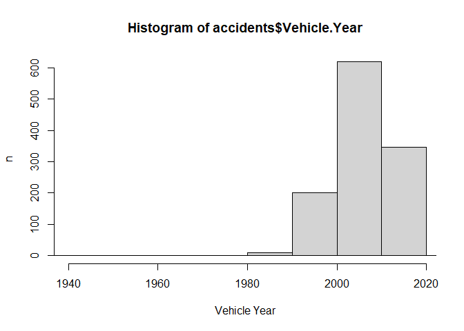
There, I’ve gotten rid of all the outliers that would have thrown a wrench in our analysis, next, I’ll make a new column for “Month of Stop” for the histogram below.
accidents$Date.Of.Stop <- mdy(accidents$Date.Of.Stop)
accidents$Month.of.Stop <- month(accidents$Date.Of.Stop)
This will be useful for my analysis later. Now let’s visualize the histogram not using base R which can’t do counts for some reason…
accidents %>% ggplot(aes(x = Month.of.Stop)) + geom_histogram(aes(y = after_stat(count)), bins = 30)
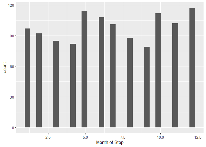
The histogram above tells us that the most accidents on record for this dataset occurred in December, this can verify that
accidents %>% count(Month.of.Stop)
##    Month.of.Stop   n
## 1              1  97
## 2              2  92
## 3              3  85
## 4              4  82
## 5              5 114
## 6              6 108
## 7              7 101
## 8              8  88
## 9              9  79
## 10            10 112
## 11            11 102
## 12            12 117
Recoding our variables
One of the most important pieces of cleaning data comes into play when we need our data to fit our method of analysis in certain ways. For example, recoding a variable into binary enables a data column to be ‘numeric’ as opposed to ‘character’ which opens up particular ways to analyze everything. See below:
#Accidents
accidents$Accident = ifelse(accidents$Accident == "Yes", 1 ,0)

#Fatalities
accidents$Fatal = ifelse(accidents$Fatal == "Yes", 1 ,0)

#Alcohol related accidents
accidents$Alcohol = ifelse(accidents$Alcohol == "Yes", 1 ,0)

#Summarize each by month of accident:
Num_Accidents <- accidents %>%
  group_by(Month.of.Stop) %>%
  summarise(sum_Accidents = sum(Accident))

Num_Fatal <- accidents %>%
  group_by(Month.of.Stop) %>%
  summarise(sum_Fatal = sum(Fatal))

Num_Alcohol <- accidents %>%
  group_by(Month.of.Stop) %>%
  summarise(sum_Alcohol = sum(Alcohol))
Now that we have our summarised columns, I’ll merge them into one dataset:
#Join variables using merge()

agg_accidents <- merge(Num_Accidents, Num_Alcohol, by = "Month.of.Stop")
agg_accidents <- merge(agg_accidents, Num_Fatal, by = "Month.of.Stop")

#Rename month column
agg_accidents <- rename(agg_accidents, month = Month.of.Stop)

#Make new month column
agg_accidents$month <- as.factor(month.name)
agg_accidents$month <- factor(agg_accidents$month, levels = month.name)

#Rename columns
agg_accidents$accidents <-  agg_accidents$sum_Accidents
agg_accidents$fatal <- agg_accidents$sum_Fatal
agg_accidents$alcohol <-agg_accidents$sum_Alcohol

#Remove redundant columns
agg_accidents <- agg_accidents[,-c(2:4)]

#Factorize the last two columns for plotting
agg_accidents$alcohol = as.factor(x = agg_accidents$alcohol)
agg_accidents$fatal = as.factor(x = agg_accidents$fatal)
Below is a sample plot I used made with the aggregated data:
accidentplot <-
     ggplot(data = agg_accidents, aes(x = accidents, y = month, color = alcohol)) +
     geom_point() +
     labs(title = "Accidents by Month and Type", x = "n",
        y = "Month") +
   theme_bw()

print(accidentplot)
However, if I were to print the ‘agg_accidents’ data, you’ll see that this doesn’t give us much to work off of.
print(agg_accidents)
##        month accidents fatal alcohol
## 1    January        97     0       0
## 2   February        92     0       0
## 3      March        85     0       0
## 4      April        82     0       0
## 5        May       114     1       1
## 6       June       108     0       0
## 7       July       101     0       0
## 8     August        88     0       0
## 9  September        79     1       0
## 10   October       112     0       0
## 11  November       102     0       0
## 12  December       117     0       1
Considering this, I’m going to take the original data set and re-work it so that I can get more meaning visualization from the data.
Another Approach
I noticed that the data contains coordinate data, so I’m going to use that to plot a map giving us some more detailed information.
First, I’m going to repeating some of my previous cleaning steps, then recode what I find useful.
#Repeating some cleaning steps from before and removing outliers:
traffic$X <- NULL
traffic <- na.exclude(object = traffic)
traffic <- traffic[traffic$Latitude != 0.00, ]
traffic <- traffic[traffic$Longitude != 0.00, ]
traffic <- traffic[with(traffic, !((Year %in% 0:1931) | (Year %in% 2024:9999))), ]


#Remove null entries from coordinates:
geo_traffic <- subset(traffic)

#Recode dates
geo_traffic$Date.Of.Stop <- mdy(geo_traffic$Date.Of.Stop)
geo_traffic$Date.Of.Stop <- as.POSIXct(geo_traffic$Date.Of.Stop)


#Editing out a couple of problematic strings by removing unneeded characters
geo_traffic[,15] <- str_sub(geo_traffic[,15], 6, -1)
geo_traffic[,22] <- str_sub(geo_traffic[,22], 5, -1)
…
Here’s a few examples of some visualizations I made using Tableau, to really a good look at our cleaned data!
So now that we have a representation of what happens in the DC area, as far as traffic stops go, as well as definitive confirmation that our data is in order. What are some questions we can ask of the data, using ggplot2?
…
Plots
Here, I want to ask as many questions of the data as I possible can, so the first thing I’m going to ask here to tell the story of this agencies’ police departments is, “How many traffic stops did each race have by year?”
ggplot(data = geo_traffic, aes(x = Date.Of.Stop)) +
  geom_histogram(aes(fill = Race, col = I("black")),
                 stat = "bin", binwidth = 5000000) +
  labs(title = "Traffic Stops by Year and Race",
       subtitle = "For DC and the Surrounding Area", x = "Year",
       y = "n")
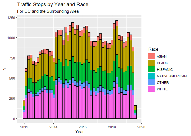
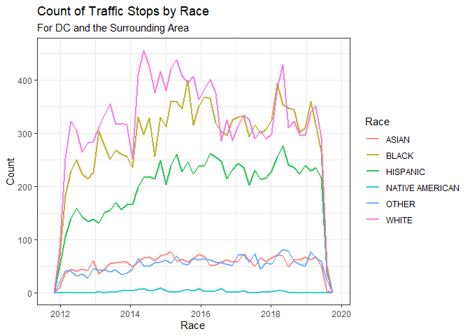
This chart offers a more nuanced look at how each race described in the data committed traffic stops by counts and Year; as the previous one represented totals for each year.
ggplot(data = geo_traffic) +
  geom_freqpoly(aes(x = Date.Of.Stop, color = Race),
                size = 1,
                alpha = .8,
                binwidth = 5000000) +
  labs(title = "Count of Traffic Stops by Race",
       subtitle = "For DC and the Surrounding Area",
       x = "Race",
       y = "Count") +
  theme(axis.text.x = element_text(angle = 90)) +
        theme_bw()
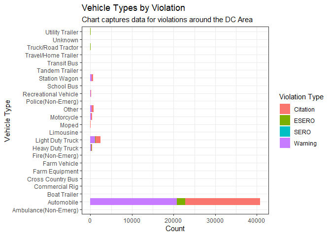
This chart captures the kinds of Vehicles used in the violations perpetrators committed over a given time period.
ggplot(data = geo_traffic) +
  geom_histogram(aes(y = VehicleType, fill = Violation.Type), stat = "count") +
  labs(title = "Vehicle Types by Violation", x = "Count",
       y = "Vehicle Type", subtitle = "Chart captures data for violations around the DC Area") +
  scale_fill_discrete(name = "Violation Type") +
  theme_bw()
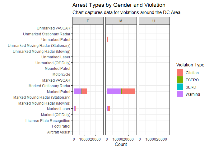
Here, we detail the type of arrest, their counts, gender and what kind of violation was committed.
ggplot(data = geo_traffic) +
  geom_histogram(aes(y = Arrest.Type, fill = Violation.Type), stat = "count", bins = 30, binwidth = 10) +
  labs(title = "Arrest Types by Gender and Violation", x = "Count",
       y = "", subtitle = "Chart captures data for violations around the DC Area") +
  scale_fill_discrete(name = "Violation Type") +
  theme_bw() +
  facet_wrap(.~Gender)
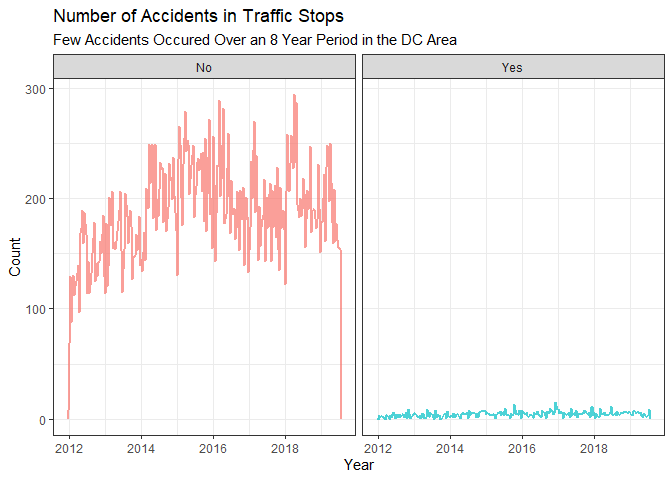
This plot below tells us the amount of accidents that occurred over the given time period.
ggplot(data = geo_traffic, aes(x = Date.Of.Stop, color = Accident)) +
  geom_freqpoly(size = .8, alpha = .7, binwidth = 1000000) +
  labs(title = "Number of Accidents in Traffic Stops", subtitle = "Few Accidents Occured Over an 8 Year Period in the DC Area", x = "Year",
       y = "Count") +
  theme_bw() +
  theme(legend.position = "none") +
  facet_wrap(.~Accident)
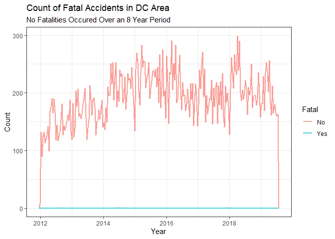
In this chart, we look at the number of fatal accidents. Thankfully, people in the DC area are relatively safe drivers according to our data.
ggplot(data = geo_traffic, aes(x = Date.Of.Stop, color = Fatal)) +
  geom_freqpoly(size = .8, alpha = .7, binwidth = 1000000) +
  labs(title = "Count of Fatal Accidents in DC Area", subtitle = "No Fatalities Occured Over an 8 Year Period", x = "Year",
       y = "Count") +
  theme_bw()
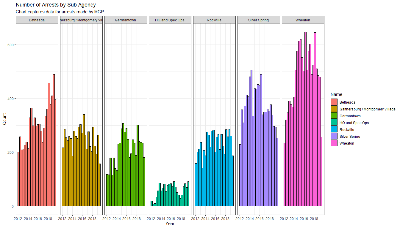
Before I plot this one, I’m recoding the names of the Sub Agencies before plotting so that they’ll look better. Lastly, this plot shows up the number of arrests made by each police department within the Agency by Year:
geo_traffic$SubAgency[geo_traffic$SubAgency == '1st District, Rockville'] <- "Rockville"
geo_traffic$SubAgency[geo_traffic$SubAgency == '2nd District, Bethesda'] <- "Bethesda"
geo_traffic$SubAgency[geo_traffic$SubAgency == '3rd District, Silver Spring'] <- "Silver Spring"
geo_traffic$SubAgency[geo_traffic$SubAgency == '4th District, Wheaton'] <- "Wheaton"
geo_traffic$SubAgency[geo_traffic$SubAgency == '5th District, Germantown'] <- "Germantown"
geo_traffic$SubAgency[geo_traffic$SubAgency == '6th District, Gaithersburg / Montgomery Village'] <- "Gaithersburg / Montgomery Village"
geo_traffic$SubAgency[geo_traffic$SubAgency == 'Headquarters and Special Operations'] <- "HQ and Spec Ops"
ggplot(data = geo_traffic, aes(x = Date.Of.Stop, fill = SubAgency)) +
  geom_histogram(color = "black", bins = 50, binwidth = 10000000) +
  labs(title = "Number of Arrests by Sub Agency", x = "Year",
       y = "Count", subtitle = "Chart captures data for arrests made by MCP") +
  scale_fill_discrete(name = "Name") +
  theme_bw() +
  facet_grid(.~SubAgency)
Conclusion
This analysis illustrated a very detailed picture of how traffic stops play out within the Washington DC and surrounding areas. We saw that thankfully, while they are indeed numerous, people are relatively safe drivers. We alas learned that whites committed the most traffic violations over the 8 year period that our data captured. While by number, Native Americas had the least and were likely the least represented.
Visualizations can be fun because looking at data in spreadsheet form can be boring, imagine trying to explain all those number to others without a story or picture to accompany your words! The funny thing is that I feel like i’ve yet to scratch the surface of what ggplot2 can do.
As always thank you for reading!